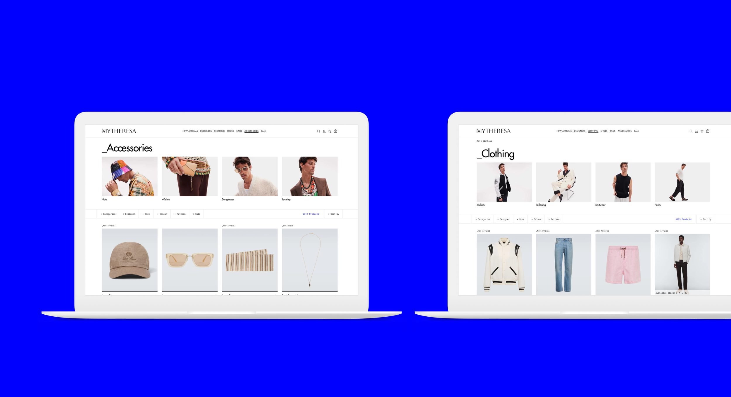
Mytheresa Men
With the addition of the menswear section to the luxury e-commerce platform, the need for a new visual language kickstarted this project
An identity within an identity: The main challenge was making the menswear section feel unique, while retaining the Mytheresa essence.
The UI
A whole new UI kit was developed for this project. Every component in the already existent Mytheresa design system was duplicated, and a menswear variable was added.
The key to the new identity was the neon blue accent color, the occasional mono-space font, new and sharper icosn, and more disruptive interaction, like sliders that scroll upon scrolling a headline in the homepage.
Mirroring an existence experience
The overall structure of pages was kept the same as in Mytheresa women, based on the hypothesis that (at least initially) most of the users would be the same that purchased in the women’s section. But we did look for small improvements that would improve the experience, and help highlight that edgier feel we wanted the menswear section to have.
Some examples are the full width add to cart and wishlist CTAs in the PDP and the interactive sliders within the product cells in the PLP. As the area became more popular, and more used exclusively by male costumers, the plan was to conduct further interviews and personalised the pages even further to their needs.


