Layla
In order to achieve consistent branding and components across all websites, apps and emails, we created Westwing’s first design system.
The steps we took
1. Simplify
The first thing we did was take stock of the previous UI elements, and see where we could simplify it. We reduced the color palette, deleted old elements that were not being used, identified the key text styles…
2. Documment
To prevent the system from becoming too complex again, we made sure to document guidelines and templates for how to create components.
A key part of this process was also deciding on a structure that would work for our System moving forward.
3. Implement
Lastly we held a 3 day sprint where all designers worked exclusively on migrating components from old design libraries to Figma, and added new ones following the structure and guidelines previously set.
The Sections
The biggest part of the Documenting stage was deciding how we wanted to structure our Design System in a way that would work for us, but also for the Developers that were going to replicate the system in their respective platforms. Previously we had been working with atomic design, but we found it had too many limitations for our team.
So finally the decision was to split the system into the four following sections:
Foundation
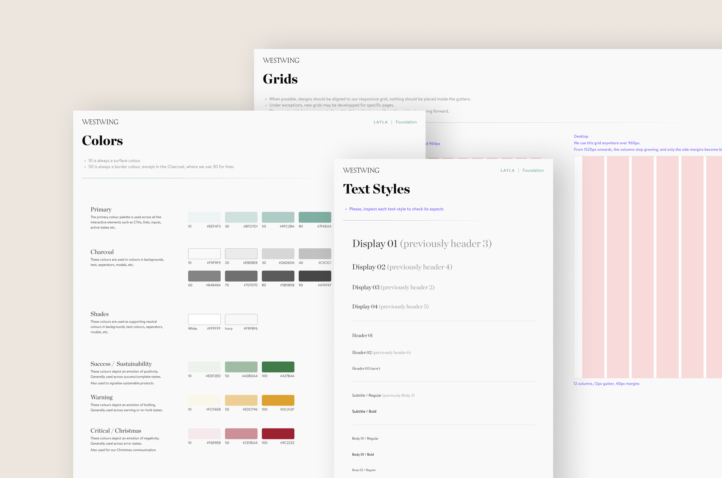
Foundation is where we kept the main guidelines on Westwing’s corporate identity. We devided it into two subcategories:
Principles: Which included the main identity elements like Colors and Text Styles
Guidelines: Which featured all of our Grids, Spacing rules, specifications on aspect ratios, etc.
Assets
The assets were for the most part what had been “atoms” in our previous sketch library. They are very simple components, that often need to be exported such as Logos, Icons, Flags, Badges, Payments…
It also included guidelines on how to create new assets so they stay within Westwing’s corporate identity.
Components
The Component section was the biggest one in the Design System. It basically included every modular and reusable element used to build user interfaces. Some example of components include buttons, accordions, sliders… or our most complex: the product cell.
As opposed to how we were working with atomic design, all components, regardless of their complexity, belonged in this section. As long as it was reusable, it should be added to Layla.
Standalones
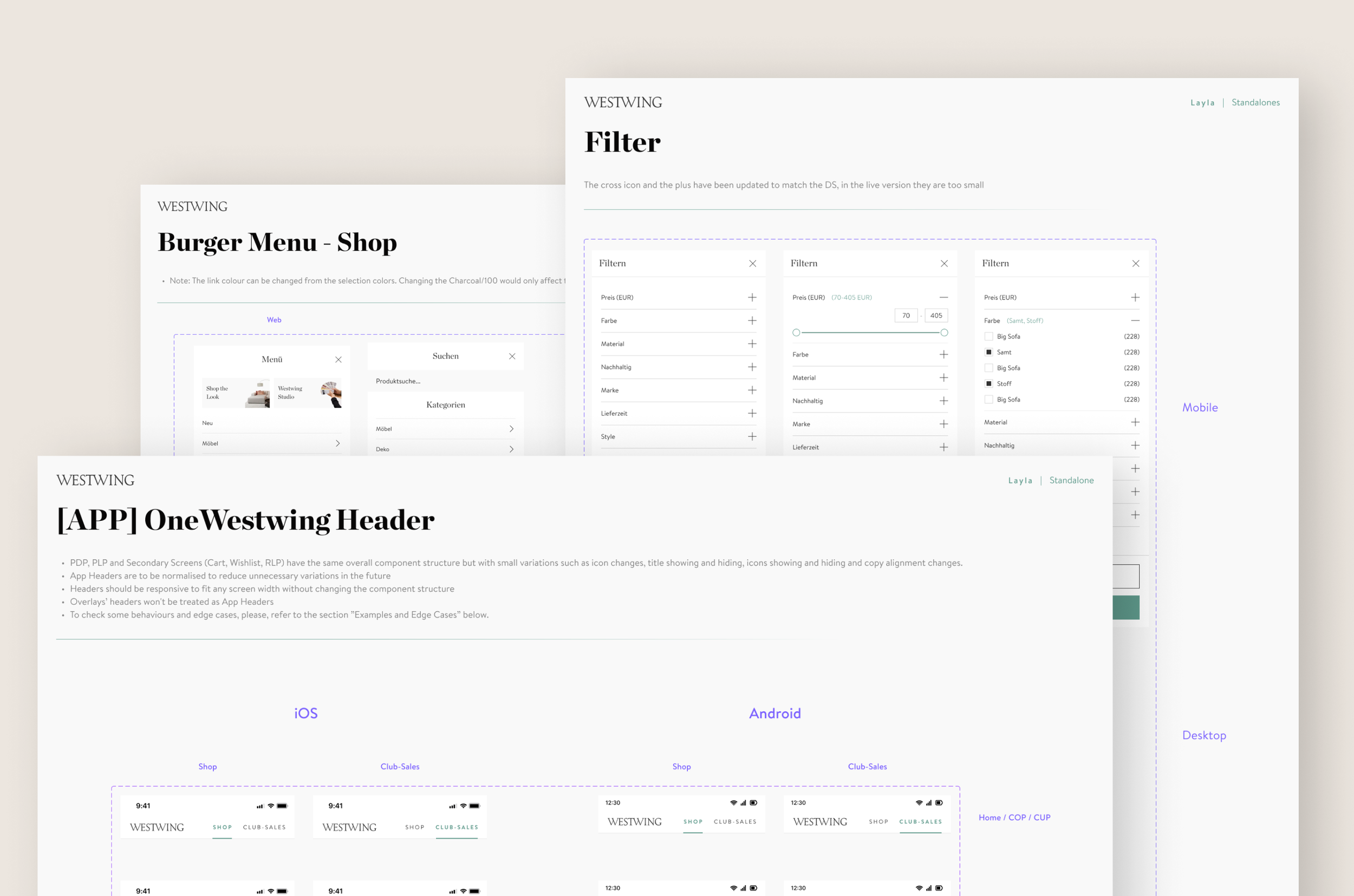
Lastly, in our previous experience working with the sketch library, we observed that there were components that we useful for us to have so we could always drag and drop, but that actually from a code perspective, were not considered as components, as they were not being reused.
That’s where we saw the need for standalones:complex components that contain several smaller pieces and are rarely reused for other occasions. Examples of standalones include Footer, Header and Menu.
Layla was immediately incorporated into our design flow, and soon started to be reflected in the different platform’s code. Allowing everyone to streamline their work, promote consistency, and expedite the design and development process.


